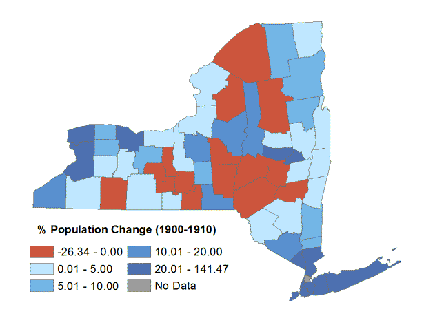
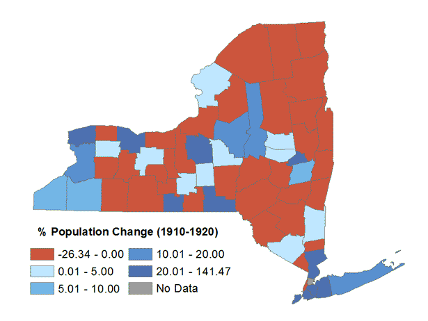
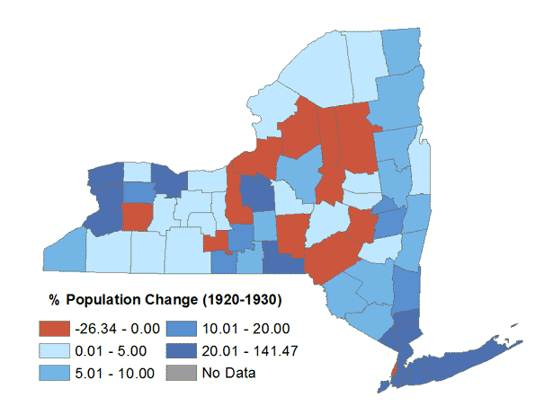
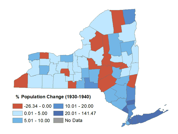
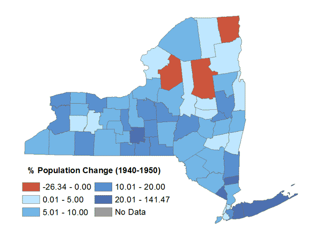
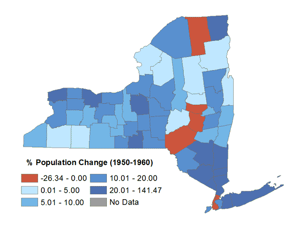
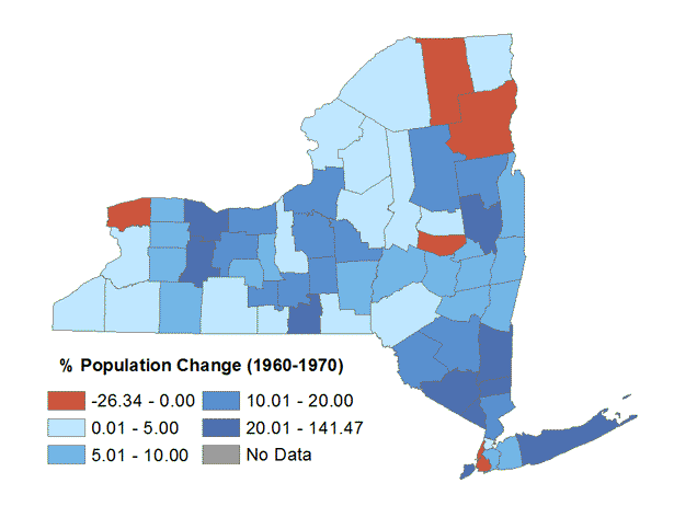
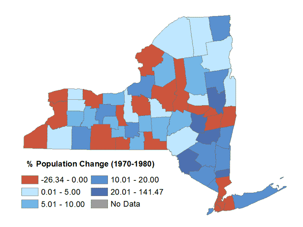
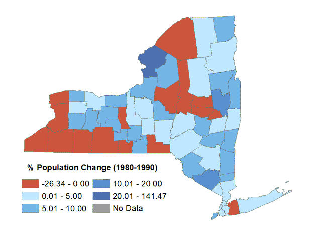
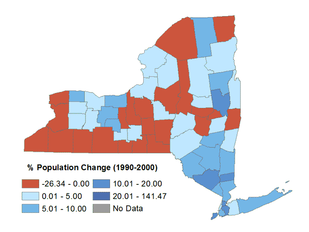
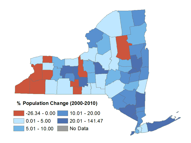
Graduated Color (Choropleth)
These maps depict the relative population change by county. Decreases in population are shown in red and the population increases are shown in shades of blue based on the percentage of increase. Note that for the 1920-1930 Population Change map, the addition of Bronx County is partially responsible for the population loss in New York County (Manhattan).
The following maps all express population change by county in New York State from 1900 to 2010. The source data and cartographic boundary files were downloaded from the US Census Bureau. Note that the modern county boundaries are used to illustrate historical population data for each of these maps.