Population Change in
New York
The following animated maps all
express population change by county in New York State from
1900 to 2010. The source
data and cartographic boundary files were downloaded from the US Census
Bureau. Note that the modern county boundaries are used to
illustrate historical population data for each of these maps.
Click on a map to view the unanimated series of maps.
Graduated Colors
(Choropleth)
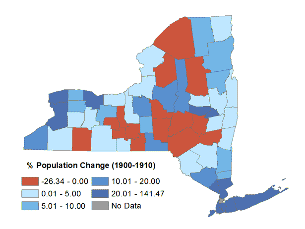
This map depicts the relative population change by county. Decreases in population are shown in red and the population increases are shown in shades of blue based on the percentage of increase. Note that for the 1920-1930 Population Change map, the addition of Bronx County is partially responsible for the population loss in New York County (Manhattan).
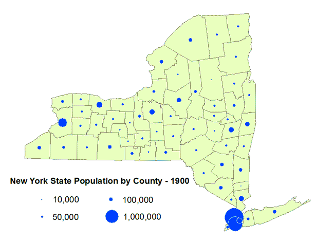
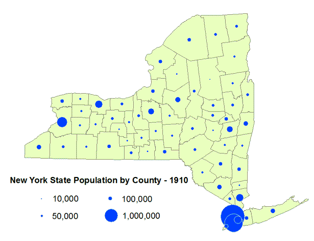
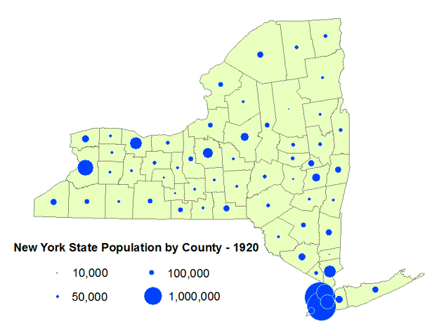
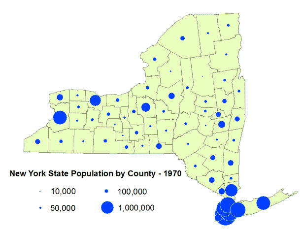
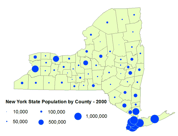
Graduated Symbols
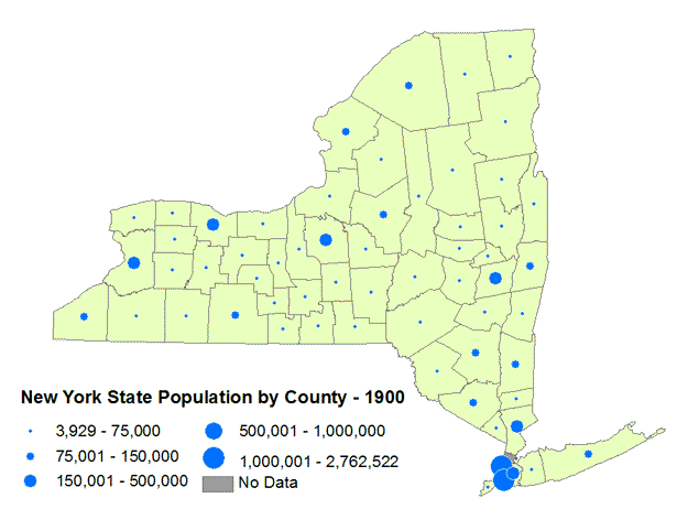
This map illustrates the total population per county by graduated symbol. Due to the categorical symbology, minimal changes in county population may not be expressible.
Dot Density
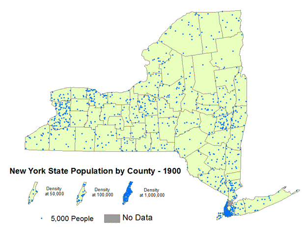
This Dot Density map visualizes total population per county. Each dot represents up to 5,000 people. Note that the positioning of the dots is random and is not intentionally associated with the specific locations of population within a county.
Gain/Loss

Proportional Symbol