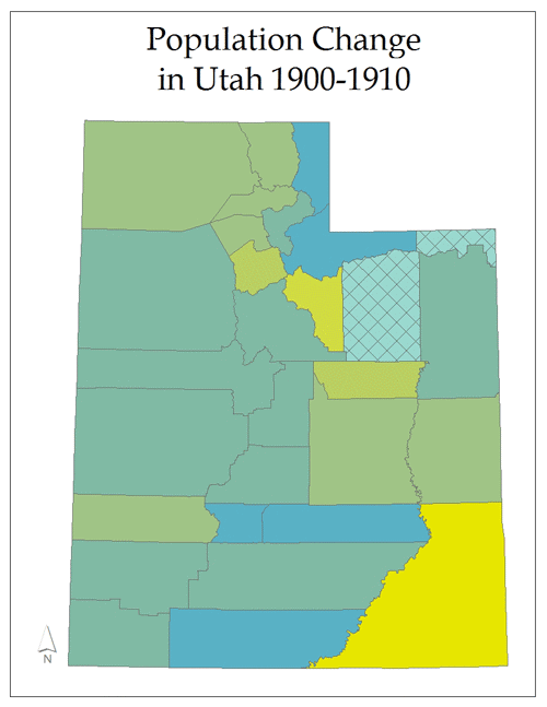
This series of maps was created to illustrated the percent of population change for each county in Utah. The numbers were dervived by using the difference in population between years then divided by the earliest year in the pair (multiplied by 100 to produce a percentage).