Project Main
Map Mash-ups
Animated Maps
3D Geovisuals
Sketch-Up
About Me
Welcome to...
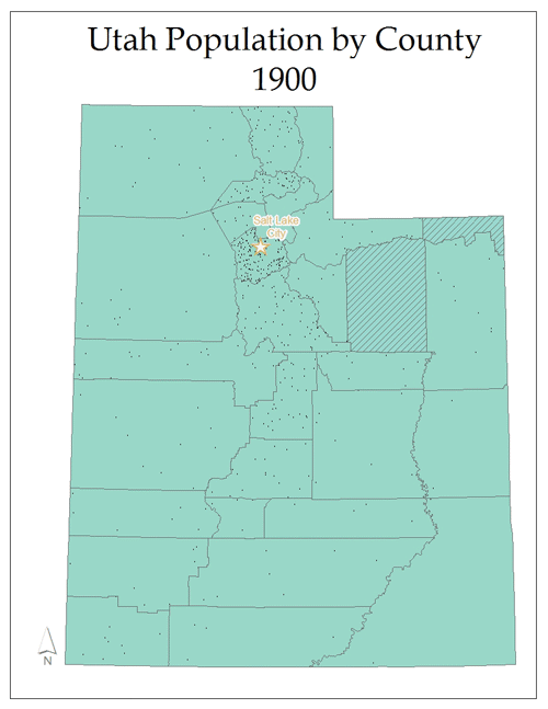
Animated Dot Density Map Page!
This series of maps was created to the growth of population in each county in Utah. As a result of the unbalance growth in the Salt Lake City region, one dot was chosen to represent 500 people.
Home
My State
K.S.U. Main
My Lab Blog
Other Projects
Contact