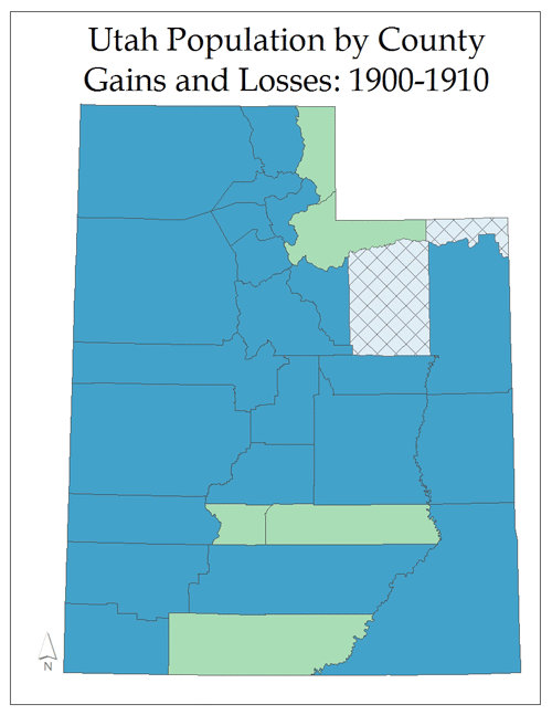
This series of maps was created to illustrated the counties in Utah that had either a positive or negative population change. These maps only depict if a county has had an increase or decrease in population, no numbers are assosicated with these maps.